Setting up Tableau to analyze your Snowplow data
1. What is Tableau, and why use it to analyze / visualize Snowplow data?
Tableau is a Business Intelligence program, in the mould of Microstrategy or Pentaho. These types of software make it possible for users to perform OLAP analysis, which typically involves aggregating data by different dimensions and metrics, visualizing that data graphically, and then exploring relationships in the data by slicing and dicing different metrics by different dimensions.
Tableau has a number of strengths which account for why we prefer it to other BI tools like Pentaho, mostly around its simplicity and connectivity:
- The user interface is simple and straightforward to use
- The interface is fast. You can setup Tableau workbooks to query the data directly in Redshift, in which case the querying speed is determined by the speed at which Redshift works. (Which is pretty good.) You can also, however, import some or all of the data (depending on the volume you're handling) into Tableau's in-memory engine, in which case analysis is blindingly fast
- Simple to deploy: Tableau desktop can be employed as a standalone application. You connect to directly to Snowplow data (e.g. in Redshift). There is no need to setup associated servers to manage a data pipeline from Snowplow to Tableau (although Tableau server is available as an option). There is no requirement to manage any metadata around Snowplow. Instead, you grab the Snowplow data directly, and start visualizing it instantly
Like most other BI tools: Tableau has limitations when used outside of traditional OLAP analysis: we do not recommend it for statistical analysis (although it has some basic capabilities) or more bespoke graphs. For this type of capability, we recommend R.
2. Download and get started with Tableau
If you are not already using Tableau, you can download a 30 day trial version of the desktop product from the Tableau website.
Note: Tableau desktop only works on Windows. If you're using Linux or a Mac, you can run Tableau in a Virtual Machine, but you really want to make available as much RAM as possible to keep the analysis on the large Snowplow datasets snappy.
Installing Tableau desktop for windows is straightforward: simply download the executable and run it.
3. Connecting Tableau to Snowplow data in Redshift
Launch Tableau, and select Connect to data from the left hand menu
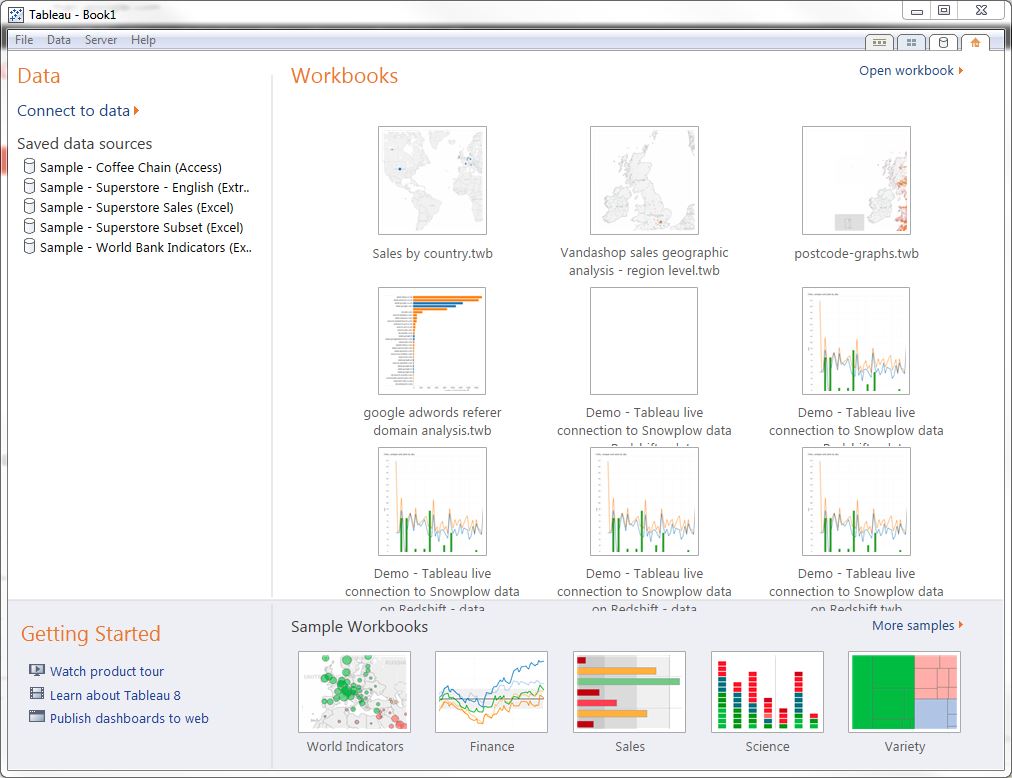
Tableau presents a list of data sources to connect to. Select "Amazon Redshift" from the On a server list:
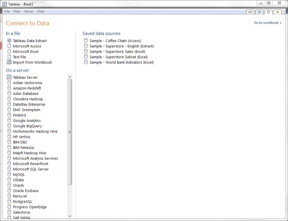
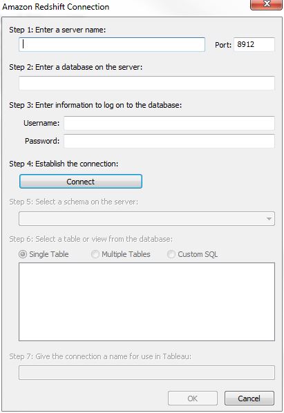
Tableau then asks for the details of the Redshift cluster we wish to connect to:
We can fetch these details directly from the AWS console. Log into console.aws.amazon.com, select Redshift from the list of services and then select the Redshift cluster you want to connect to. The details of the cluster you need to connect Tableau are listed under Cluster Database Properties:

- Copy the database end point from the AWS console and paste it into the server name field in Tableau
- Copy the port number from the console into Tableau
- Copy the database name and username into Tableau
- Enter the password for the Redshift database. (This is not displayed in the Amazon console for security reasons.)
- Click the Connect button. Tableau will ping out to Redshift to check the connection is live
- Select public from the dropdown list of schemas. Your Snowplow events table should be one of the tables listed:
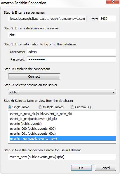
- Select your Snowplow events table and click OK
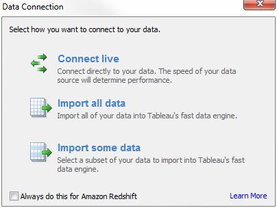
- Tableau asks if you want to "Connect live", "Import all data" or "Import some data". Select "Connect live"
- You should see a screen similar to the one below:
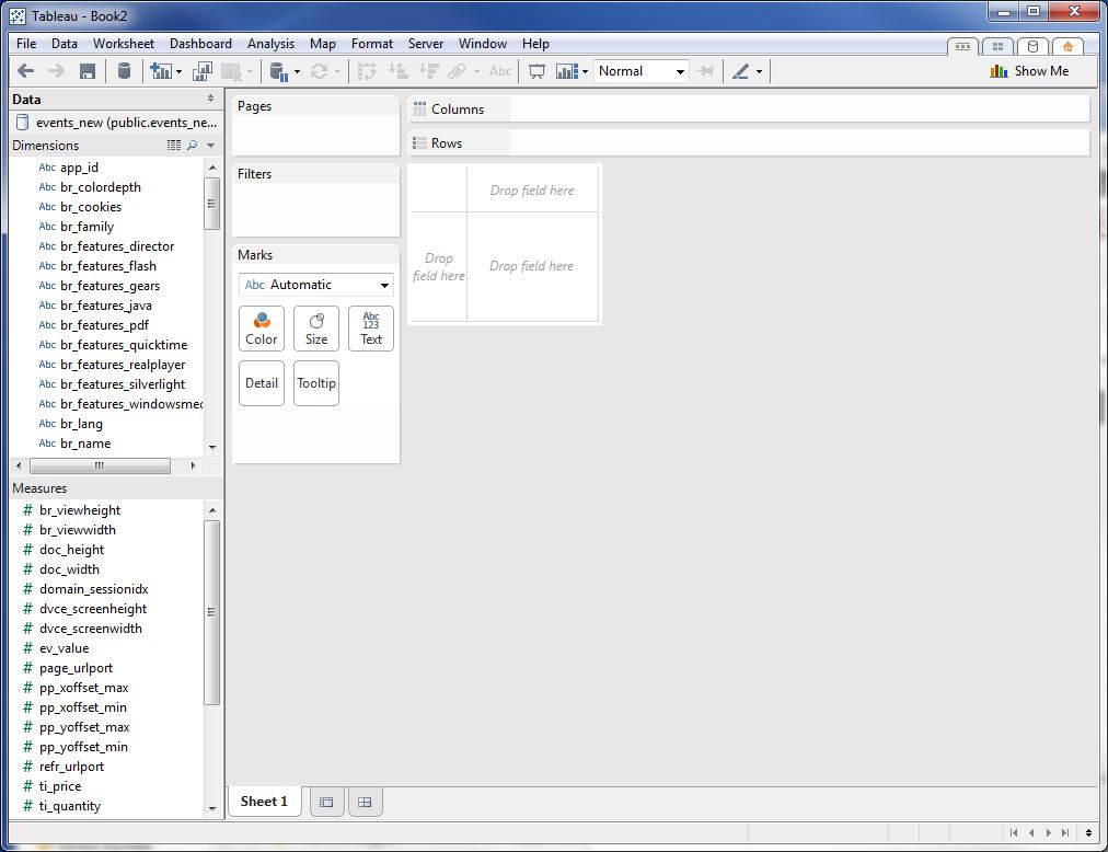
Troubleshooting your connection: For security, Amazon only lets computers access a Redshift cluster where those computers are located at an IP address that has been white-listed. Hence, in order to connect Tableau, you must make sure that the machine running Tableau is on a white-listed IP address. Instructions on how to white-list IP addresses in Redshift are given here.
4. Getting started analyzing Snowplow data in Tableau
4.1 Plotting our first graph: number of uniques over time
To kick in the tyres, we'll walk through the process of plotting the number of uniques that visit the site over time.
"Uniques" is a metric. (Or in Tableau terminology - a "measure".) If you look in the list of measures in Tableau, you wont see "Uniques": all the fields you'll see are columns in the Snowplow events table where the data type is numeric. In some case, these really are metrics / measures (e.g. "ev_value", "ti_quantity", "ti_price", "tr_total", "pp_yoffset_max", "pp_yoffset_min" etc.) In other cases, Tableau has incorrectly assumed that numeric dimensions are measures (e.g. "domain_sessionidx", "dvce_screenheight", "page_urlport", "txn_id"). We can simply drag those incorrectly classified fields from the "Measures" pane into the "Dimensions" pane.
We need to create a "Uniques" measures field. This will be calculated by counting the number of distinct user IDs. (In our example, we're going to count the number of distinct "domain_userid".) To do this, right click on the "Measures" pane and select "Create calculated field". Name the field "Uniques" and enter the following formula into the formula box:
COUNTD([domain_userid])
Tableau helpfully tells us that are calculation is valid:
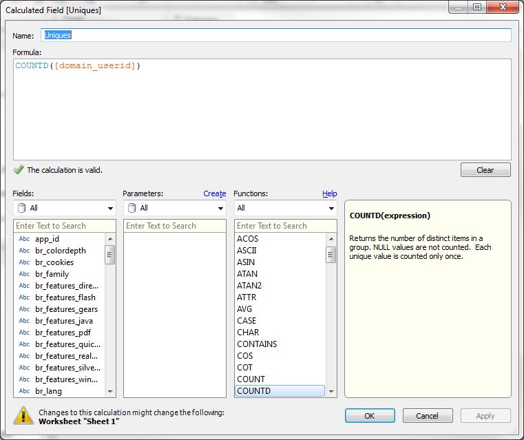
Select OK. The new field appears in the Measures pane. We can now drag it into the main part of the screen, where it says "Drop field here":
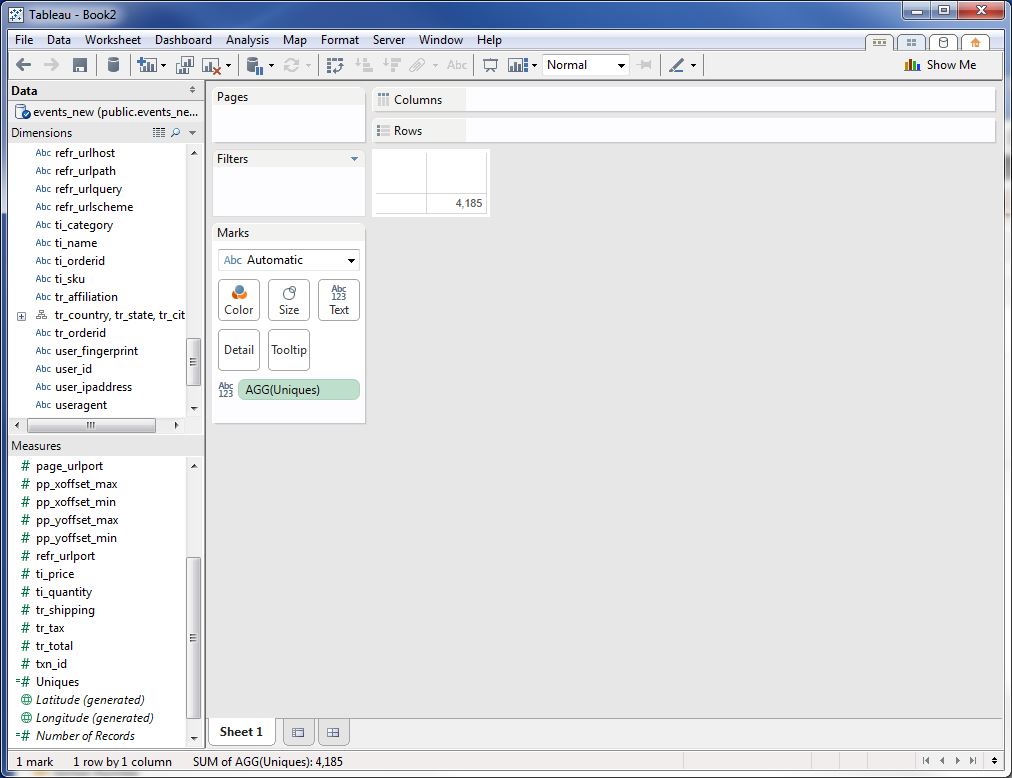
Note that the total number of uniques for our data set shows on the main part of the screen. Tableau reminds us what the number means: in the Marks section of the window, AGG(Uniques) is listed next to an icon that indicates that this measure is plotted simply as a label.
Now we want to slice the number of uniques by day. To do this, drag the "collector_tstamp" dimension from the "Dimensions" pane to columns shelf:
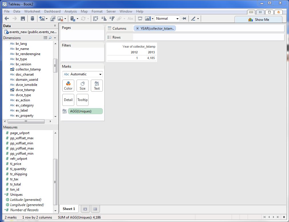
Tableau has assumed we want to plot uniques by year. To change the level of granularity so we plot it by day, hover over the "YEAR(collector_tstamp)" dimension in the column pane and then click on the dropdown option that appears. Select the 2nd "Day" option in the dropdown to make this change.
Now to make the plot a familiar line graph, click on the Show me toolbar at the top right. A toolbar appears. Select the line graph image:
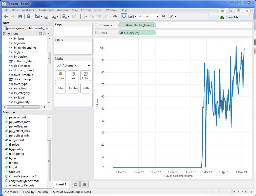
Bingo! Our line graph appears!
4.2 Further analysis: best practice when using Tableau with Snowplow
In the above example, we used Tableau to connect to the complete Snowplow events data table. This can, potentially, be an enormous volume of data. For that reason, when asked whether we wanted to import the data into Tableau, we declined, instead connecting "live" to Redshift. As a result, every time we performed an operation in Redshift (e.g. dragging a metric or dimension around the screen), Tableau went off and ran a query against Redshift to fetch the appropriate cut of data necessary to perform the operation we specified. Redshift, rather than Tableau, did all the heavy data lifting.
Often, however, when we are performing analysis on Snowplow data, we are looking at a subset of that data, rather than the entire data set. In this situation, we may want to import the data into Tableau's fast data engine, to make the analysis snappier.
Tableau makes it straightforward to specify specific cuts of Snowplow data to grab from Redshift. To demonstrate this, click on the Data menu in Tableau and click on Connect to data. You should see the same screen that you did before, when we set up our first connection to Redshift.
This time, go through the process as before: select Redshift, enter the details from the Amazon console, and select the public schema. This time, however, select "Custom SQL" instead of "Single Table" under "Step 6: Select a table or view from the database":
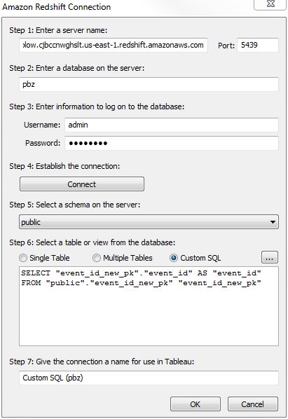
You can paste in any Redshift compatible SQL query to generate a specific slice of the data. To give a simple example, the following query:
SELECT
 domain_userid,
 domain_sessionidx,
 collector_tstamp,
 page_urlpath,
 page_title,
 event
FROM events
WHERE domain_userid = '594b77eb9d30435b'
AND (event = 'page_ping' OR event = 'page_view')
ORDER BY domain_userid, tstamp
was used to grab the data for a single visitor. That was then used in Tableau to visualize that user journey.
To give a more complicated example:
SELECT
pv.page_urlpath,
pv.unique_visitors,
ab.uniques_that_add_to_basket,
t.uniques_that_purchase
FROM (
 SELECT
 page_urlpath,
 COUNT(DISTINCT(domain_userid)) AS unique_visitors,
 COUNT(*) AS page_views
 FROM "events"
 WHERE (                                    # Only display results for *product* pages
  (page_urlpath LIKE '/tarot-cards/%' )
  OR ( page_urlpath LIKE '/oracles/%' )
  OR (page_urlpath LIKE '/pendula/%')
  OR (page_urlpath LIKE '/jewellery/%')
 ) AND "event" = 'page_view'
 AND page_urlhost = 'www.psychicbazaar.com' # Only display results for the *production website*
 GROUP BY page_urlpath
) pv
LEFT JOIN (
 SELECT
 page_urlpath,
 ev_label AS product_sku,
 COUNT(DISTINCT(domain_userid)) AS uniques_that_add_to_basket,
 COUNT(*) AS number_of_add_to_baskets,
 SUM(ev_property) AS number_of_products_added_to_baket
 FROM events
 WHERE (                                    # Only display results for *product* pages
  (page_urlpath LIKE '/tarot-cards/%' )
  OR ( page_urlpath LIKE '/oracles/%' )
  OR (page_urlpath LIKE '/pendula/%')
  OR (page_urlpath LIKE '/jewellery/%'))
 AND "event" = 'struct'
 AND "ev_category" = 'ecomm'
 AND "ev_action" = 'add-to-basket'
 AND page_urlhost = 'www.psychicbazaar.com'
 GROUP BY page_urlpath, product_sku
) ab
ON pv.page_urlpath = ab.page_urlpath
LEFT JOIN (
 SELECT
 ti_sku,
 COUNT(DISTINCT(domain_userid)) AS uniques_that_purchase,
 COUNT(DISTINCT(ti_orderid)) AS number_of_orders,
 SUM(ti_quantity) AS actual_number_sold
 FROM events
 WHERE "event" = 'transaction_item'
 GROUP BY ti_sku
) t
ON ab.product_sku = t.ti_sku
to produce a data set where there was one line of data for every product sold on the website. Tableau then took this much smaller data set, and used it to produce a scatter plot.
When you fetch smaller data sets from Snowplow / Redshift, you can ask Tableau to import these rather than read them directly from Redshift:

5. Next steps
There is a huge number of ways you can interrogate Snowplow data using Tableau. For some ideas, see the following blog posts for some examples: